
Context
When thinking about flying cheap, we have some airlines installed on the top of our minds.
Ryan Air is one of the flagships of the low cost airline companies, but what does low cost really means?
Sometimes we relate low cost with worse service, but in fact it should be offering lower prices by giving less services or optimizing existing ones in order to cut costs.
One of the ways to cut costs nowadays is through digitalisation, like with a mobile flight booking app, and I will try study and determine the state of the Ryan Air booking experience, its pain points and try to improve it.
Before the first evaluation, I will first describe what I guess a user from a low cost carrier such as Ryan air might desire, expect and be looking for on a low cost carrier.
User expectations assumptions
- Find the Best Price.
- Find the Best Day and Time.
- Immediateness.
- Transparency
- Get direct Flights if possible.
- Know what can be carried.
The methodology
The road I chose from pain points to solution design is the following:
- I will perform an Heuristic Evaluation, analyzing rules of thumb of UX and best UI practices.
- From the derived set of heuristics and previous assumptions I will do a formative user testing, with 3 to 5 users.
- From its results (observation and interview) I will try to challenge my previous pain points assumptions, and list them by severity
- From the results analysis I will define an structured solution, skeleton and trying to improve the UI of one or two screens that has been determined as more problematic
- It is important to note that I would typically prefer to test the new UI proposal, by building a low or mid fidelity clickable prototype and iterate it with other users until arriving to the most optimal solution.
- A hi-fi prototype will be delivered with the solution proposed
Heuristic Evaluation
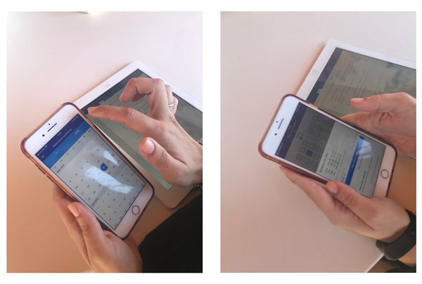
In order to identify the booking flight process pain points I have done an analysis to test the process usability.
The outcome of it will be used as material to:
- List the primary issues to be solved.
- Build user testing scenarios.
- Test whether my findings and assumptions of in-app problems also explain average user struggles as well
The findings of this analysis will be sorted upon severity in the following form:
- Correct: It contributes to improve user experience.
- Low severity:The issue does not happen in a critic part of the process or is easy to recover from it.
- Medium severity: Recursive problem or difficult to recover from it.
- High severity: Problem that is present during all the process and it’s blocking the correct competition of the task.
Home
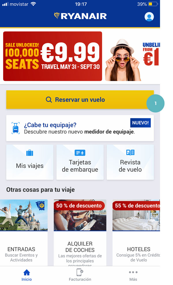
1. Low: The button to start the booking process does not hold the maximum visual hierarchy of perception. It might be difficult to find it. I would be a good idea to give it more white space and a background to highlight it.
Flight search form
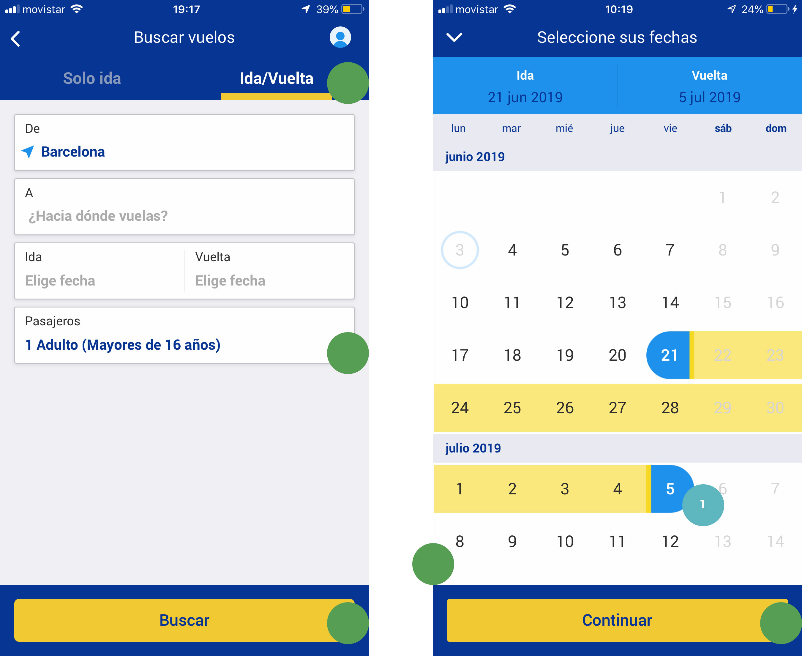
1. Low: The calendar does not provide information from a cost perspective . It would be a good idea to provide information of the days with the cheapest flights available.
Correct: There is a clear highlighting and understanding of the type of flight selected (one way/return).
The form is easily scannable and the user is provided elements clear enough not to doubt how to follow the process.
The feedback of what days desired days are selected is ok.
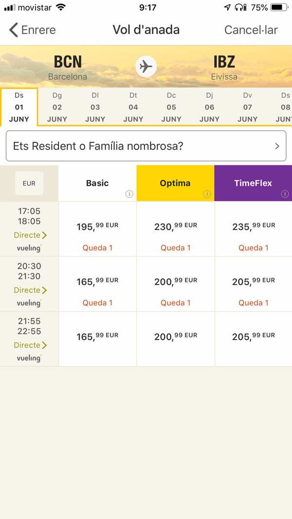
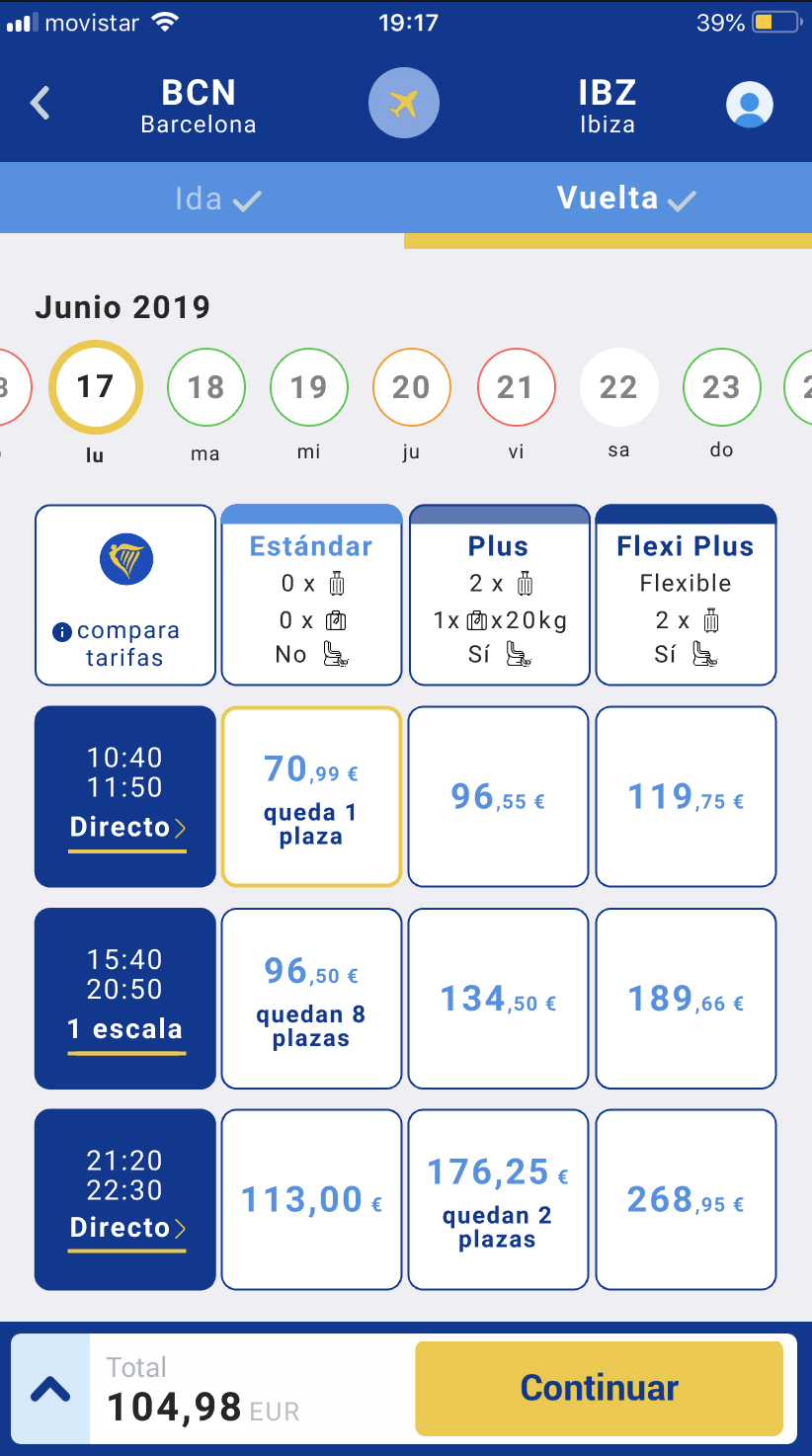
Flight selection
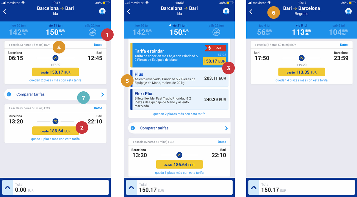
1. Severe: There is no element on the UI to signify the day bar can slide, this can cause users to redo the search if the price or options on the current selection are not optimal for their preferences. I would be nice to add signifiers to this feature to avoid users to go back to make another search.
2 & 3. Severe: The CTA to proceed to the selection might not be perceived as such, also it is too small and it is in an unnatural place. From an ergonomic and perception perspective might be difficult to understand or tap, causing the process to be abandoned.
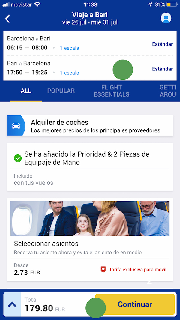
4. Medium: Crucial information about if the flight is direct or not is too small and can be easily avoided. The “Datos” copy-write is not enough descriptive.
5. Medium: The fare description is hidden until the user selects a certain price, it does not allow to compare effectively between other options, once tapped an extra CTA appears, making it even more confusing.
6. Medium: The system feedback informing that the current screen is the one corresponding to the return flight is not enough obvious. It’s copywriting is not consistent. (Regreso vs Vuelta)
7. Low: The asymmetric fare comparison button is placed between the different flight options and has a signifier that is perceived as continuing the process forward, when in fact is a pop-up. It might confuse users and break the process. I would add symmetry to it and inform it in the UI in a fashion that is not perceived as such as is now.
Passenger data
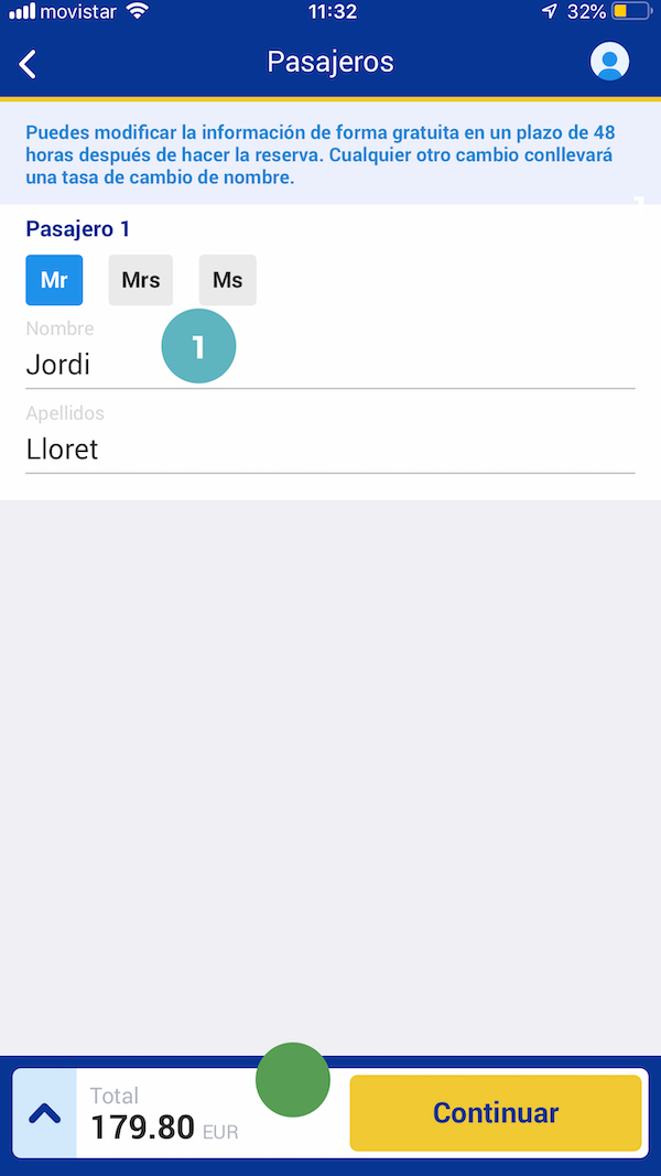
1. Low: The label contrast is too low for each input.
Correct: User is provided elements clear enough to not to doubt how to follow the process.
Seat selection
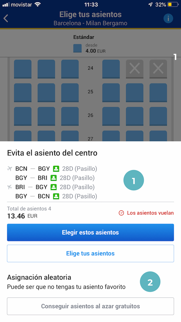
1. Low: In general, though it is not blocking, all the seat selection experience has too many cognitive charge, the way information pops up and it is structured might be annoying.
2. Low: Though I understand the reasons, the aleatory free seat selection is not effectively perceived, making it, if not, a dark pattern. I should be more visible.
Confirmation Page
Correct: In general, summary is quite visible and in a proper hierarchical position, user is provided elements clear enough to not to doubt how to follow the process.
Login Page
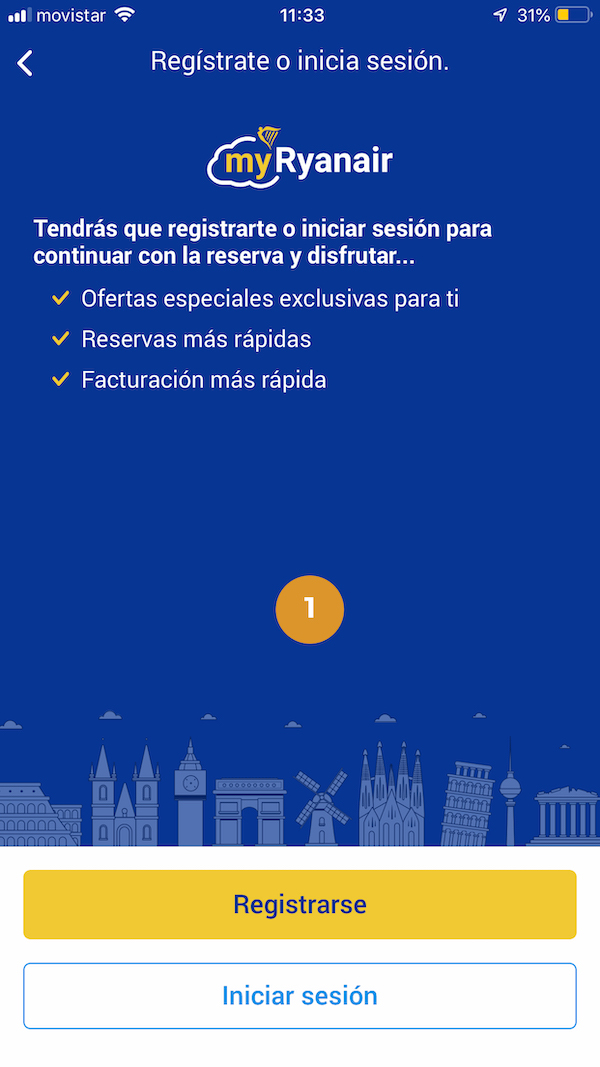
1. Medium: User is forced to register or to log in. Here I ended my evaluation test.
I strongly believe it would be a good idea to let users book as a guest.
Results
Even though this evaluation could have been much more exhaustive, I gathered enough information to get a scent of the major pain points. With the following table I will sort the screen/s that needs more love and will help me as well to build the task users will have to perform..
| Screen | Low | Medium | Severe |
|---|---|---|---|
| Home | 1 | 0 | 0 |
| Flight search form | 1 | 0 | 0 |
| Flight selection | 1 | 3 | 3 |
| Passenger data | 1 | 0 | 0 |
| Seat selection | 2 | 0 | 0 |
| Confirmation Page | 0 | 0 | 0 |
| Login Page | 0 | 2 | 0 |
So seems clear, the flight selection UI seems to hold most of the severe problems of the process tested (so far).
Test Plan
Test Plan
After the findings on the heuristics and my user assumptions I have prepared a questionnaire, scenario and a final interview to dig deeper on the following questions:
- The process is done effectively and without doubts to reserve the best price?
- The process is done effectively and without doubts to reserve the desired day and time in relation to the price?
- The process inform effectively and without doubts the conditions of the fare?
Resulting in the following plot:
Objectives
- Testing Section: Flight Selection
Previous Questionnaire
Welcome! Please complete this before we begin.
Name:
1. Are you currently making travel bookings on a computer or mobile?
- Computer
- Mobile
- Both
- Neither
2. Do you personally plan trips online?
- Yes
- No
3. How familiar are you with Ryan Air app?
- Very familiar
- Somewhat familiar
- Not familiar at all
4. How many times have you used the Ryan air app in the last 6 months?
- 0
- 1 time
- 2 – 3 times
- More than 3 times
Scenario (task)
“Llega el verano y quieres hacer un viaje durante un fin de semana largo cualquiera de junio, con tu pareja. Os decantáis por ir a Palermo (Italia).
Quieres la tarifa más barata posible, pero te gustaría tener asientos juntos y llevar equipaje de mano.”Reserva un vuelo en la app que se ajuste a tus necesidades.
Final Interview
- From 1 to 7, being 1 very easy and 7 very difficult how was the booking process
- The information about the allowed baggage was clear during the process?
- The information about the selected fare is understood (during, at the end)?
- Are you sure it was the cheapest flight as possible?
- Agrees to the fact that has to register to proceed?
- What do you expect from this brand?
- How would you make the experience twice the better
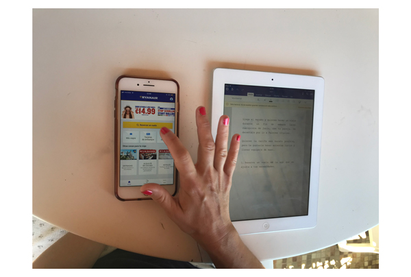
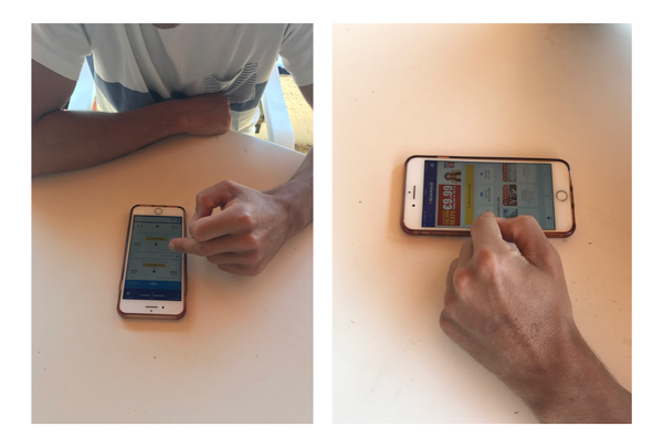
The test
The test was performed in a formative style way, with 3 volunteers. All of them are digital savvy. Their ages were 30 and 41 and 42.
Each test took between 10 and 15 minutes.
The questionnaire and the task were provided in separate sheets and they were able to review it during the process. They were moderated but not helped or guided by any means.
Questionnaire answers:
| Question | Judith | Meritxell | Mario |
|---|---|---|---|
| Are you currently making travel bookings on a computer or mobile? | Mobile | Computer | Mobile |
| Do you personally plan trips online? | Yes | Yes | Yes |
| How familiar are you with Ryan Air? | Not familiar at all | Not familiar at all | Somewhat familiar |
| How many times have you used the Ryan air app in the last 6 months? | 0 times | 0 times | More than 3 times |
Test 1: Judith
Observed / Says out loud
- Comparar tarifas es muy complicado.
- Le gustaría mucha ver la ida y la vuelta como Skyscanner, o una tabla como Vueling, ha costado entender que era solo ida.
- No ve como ordenar por precio.
- Que todo el cuadro del vuelo no sea clickable le genera dudas.
- Es una
mierdaesta app, cada asiento el precio es distinto.
| Question | Answer | Metrics | Succed? |
|---|---|---|---|
| From 1 to 7, being 1 very easy and 7 very difficult how was the booking process | 5, un poco complicado. | 1.Is able to find the desired flight? | YES |
| The information about the allowed baggage was clear during the process? | No | 2.The information about the allowed baggage is clear? | No |
| The information about the selected fare is understood (during, at the end)? | Si, pero se ha dado cuenta después | 3. The information about the selected fare is understood? | NO |
| Are you sure it was the cheapest flight as possible | NO | 4.Got the cheapest flight as possible? | NO |
| Agrees to the fact that has to register to proceed? | No le gusta | 5. Agrees to the fact that has to register to proceed? | NO |
| What do you expect from this brand? | Espera poco, tarifas baratas y mal servicio | 6. The app provides enough cost perspective? | NO |
| How would you make the experience twice the better | Ida y vuelta junto o más clara |
Test 2: Meritxell
Observed / Says out loud
- Posibilidad de saber de inicio si el vuelo tiene siempre escalas.
- No ha visto el intercambiador de días superior.
- Dificultad al presionar el botón interior de la targeta del vuelo deseado.
- Se da cuenta que paga por los asientos durante la selección de asientos, no sabe como proceder para no pagarlos. Le da un poco de rabia.
| Question | Answer | Metrics | Succed? |
|---|---|---|---|
| From 1 to 7, being 1 very easy and 7 very difficult how was the booking process | 3, normal | 1.Is able to find the desired flight? | YES |
| The information about the allowed baggage was clear during the process? | No, falta describir mejor que es el equipaje de mano, le ha pasado tener sorpresas. | 2.The information about the allowed baggage is clear? | No |
| The information about the selected fare is understood (during, at the end)? | No, sorpresa con el asiento, equipajes. | 3. The information about the selected fare is understood? | NO |
| Are you sure it was the cheapest flight as possible | NO | 4.Got the cheapest flight as possible? | NO |
| Agrees to the fact that has to register to proceed? | Esta en desacuerdo | 5. Agrees to the fact that has to register to proceed? | Yes |
| What do you expect from this brand? | Transparencia desde el principio | 6. The app provides enough cost perspective? | NO |
| How would you make the experience twice the better | Mejor claridad en el tema de las escalas. |
Test 3: Mario
Observed / Says out loud
- No ha visto el botón inicial de la home.
- Repite varias veces el proceso de búsqueda, adelante y atrás, rellenando campos de nuevo para encontrar el vuelo más barato.
- Dificultad al clicar botón interior card vuelo.
| Question | Answer | Metrics | Succed? |
|---|---|---|---|
| From 1 to 7, being 1 very easy and 7 very difficult how was the booking process | 2, dice fácil | 1.Is able to find the desired flight? | YES |
| The information about the allowed baggage was clear during the process? | No mucho | 2.The information about the allowed baggage is clear? | No |
| The information about the selected fare is understood (during, at the end)? | SI, no entra nada | 3. The information about the selected fare is understood? | Yes |
| Are you sure it was the cheapest flight as possible | NO | 4.Got the cheapest flight as possible? | NO |
| Agrees to the fact that has to register to proceed? | Es ok | 5. Agrees to the fact that has to register to proceed? | Yes |
| What do you expect from this brand? | Poca cosa, que no le cobren por sorpresa. | 6. The app provides enough cost perspective? | NO |
| How would you make the experience twice the better | Claridad precio completo desde inicio. |
Results wrap up
From this small sample test we were able to see that some of the pains stated on the heuristics are coincident to the most frustrating or severe issues that the testers encountered. The interview also showed that some of the bad reputation of the brand could be improved by providing more clear information. It’s important to note that the test and the means to do it would not allow me to build a proper SUS scale or similar, but were formative enough to build an skeleton of a solution.
Here is the summary:
- All suffered the fact the booking system is inefficient providing a cost/day perspective when choosing a flight.
- All suffered the fact booking system is inefficient providing a cost/flight/fare perspective when choosing a flight.
- All suffered surprises and frustration when adding hidden cost on late process stages
- One complained non direct flights should be more effectively informed on the UI
- One had difficulties to find the book flight home button
- One mentioned Vueling and Skyscanner
If we compare this with the result of the heuristics we could convene that the revamp of the flight selector screen would ease much of the pain points we are observing.
I also reviewed Vueling app in order to see the approach to the issues found above:
In general we observe that the Vueling flight selector screen, gives a better day cost perspective versus fare, but still fails in explaining what are the most cheaper absolute prices available depending the day, and is not helping neither to explain on the first eye scan what does every fare include.
It’s aesthetics also could be improved (at least in this particular screen).
Sketching the solution
The optimal flight selector screen should offer and effectively do:
- Clearly inform if we are choosing the outbound or the return flight
- Must inform in an easy and pleasant way if there is cheaper days around without restarting the search
- On a certain day at a certain price user must be capable to compare price / services included between different flights
- Leaves no doubt if the flight is direct or not
My approach
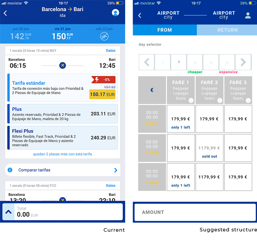
In the wireframe above we can observe the following:
- I intend to improve the space usage by moving the section were the other days price is is located, instead there is two new more visible navigable tabs that inform of the current step of the process.
- This gives enough room to make a better perceivable day slider.
- The following section evolves from a card per flight to a grid. Why a grid? It allows the user to scan more easily the information, and to learn quickly the options available, allowing to compare flights with fewer interactions.
- We can now compare up to 3 flights without scrolling, thus the information received is clearer and we get less surprises
Once defined the strategy, the scope the structure and skeleton I proceed draw the final interaction and visual proposal.
The final UI
The proposal brekdown.
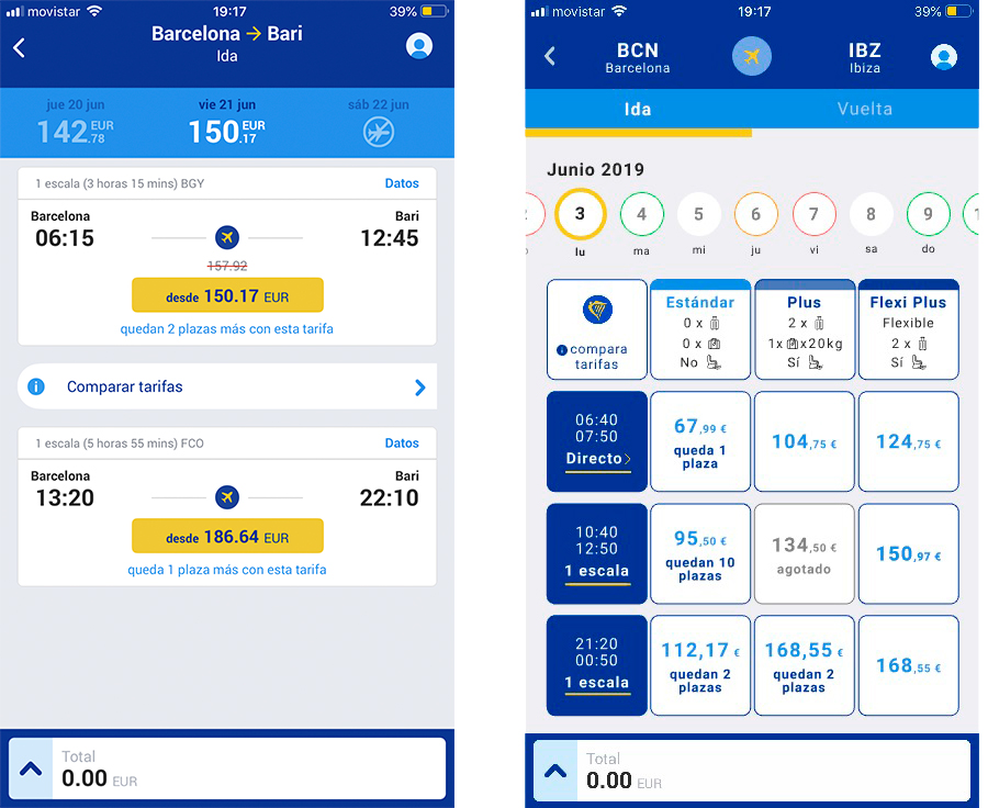
Previous vs Proposal
Header and day swiper
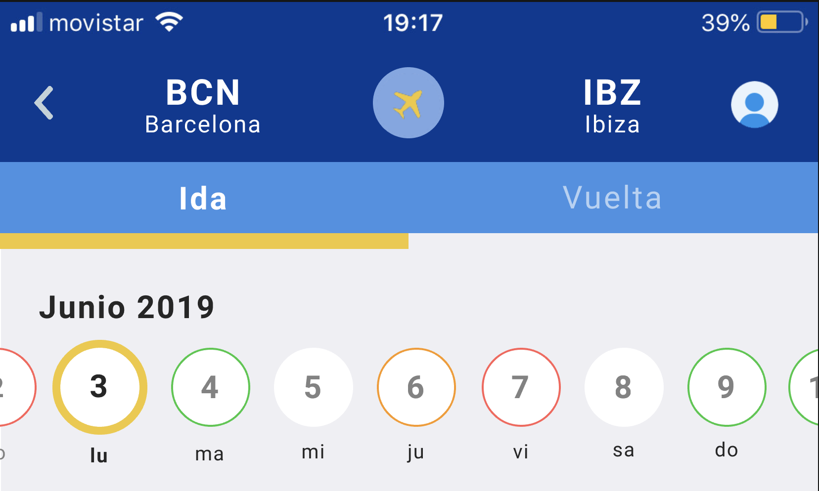
I propose to make now the header a symmetric area that will align conveniently the origin and the destination desired with the step of the process we are following (Outbound/return), also now the user can perceive and relate easily what is being selected with the origin and viceversa. Also, I decided to include the name of the airport of the city, this might come handy when city owns different and more distant airports.
Header and day swiper
The day swiper is modified and simplified in a way that now.
- Swipe feature now is signified by the presence of partially hidden days
- There is a new code color circle border, that hopefully will be easily perceived, learnt and understood as a price guide, being green cheaper than the first selection, orange similar but more expensive, red definitely more expensive
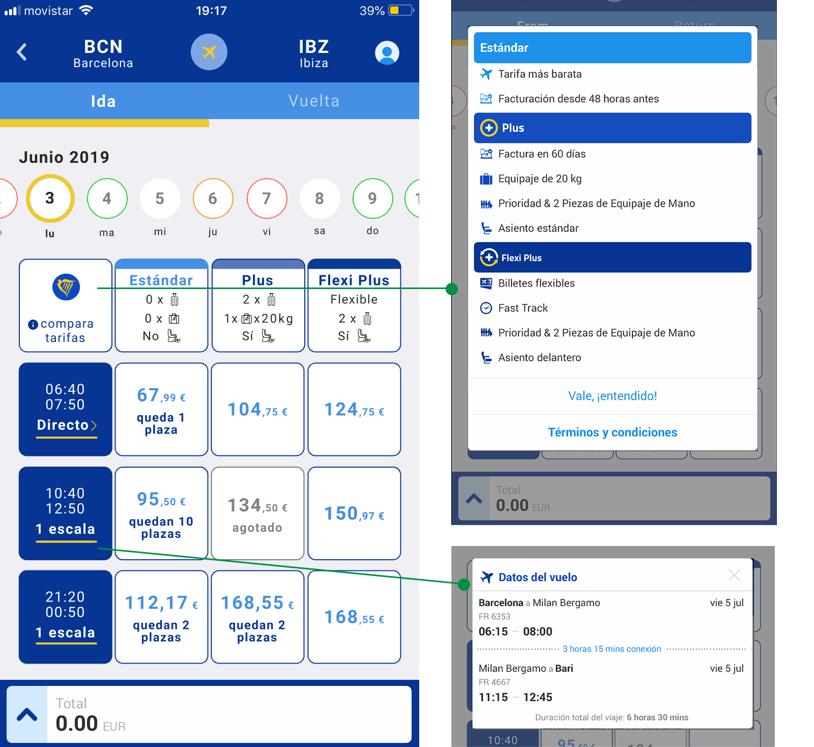
Grid
With the new grid I tried to make an structure that could offer a complete cost / avaibility / fare perspective with total transparency and allow the user to have all the information clear to follow the process with much less probabilities of being frustrated by hidden costs or surprises.
- The fare row has now a summary with the main service included, presented in the form of icons
- To view more detail of the fares, the old non symmetric button has been place on the top left cell of the grid
- The flight column also is tappable, each cell intends to clearly inform, blending with the brand’s visual language, the duration and condition of the flight. If tapped would show the detail of the flight (located under Datos before)
- Now each flight sale is bigger, making it easier to select, but also adds room to add more information, a bigger price, discounts if necessary.
- Also each border can bring information and feedback, green if it is a good deal, yellow if selected
The confirmation
I added a visual check next to each selection tab (Ida/vuelta) when completed, as I observed on the test that was not perceived at all as the screen had primary no differences, and was making user to not gain any process advance feedback.
I opted, unlike the current Ryan air app, to leave to user discretion the “CONTINUE” action. Previously, once the flights were selected, they were directly driven to the next screen. I believe that with the new system, even that it might seems to make a funnel escape, I strongly believe that the capability to navigate back and forth to review the made selections will increase the confidence on the overall process, not feeling so pushed, and avoiding further process bounces.
The takeaway
Even though my time was very limited, and the evaluation and the test were not as exhaustive as it should be, it is pretty obvious that the Ryan air app could improve its usability, conversions and thus the overall experience and brand reputation with some not so dramatic changes on how the UI and the information architecture is offered.
After working on it I really feel the need to improve things like the home page, the seat selection, the login and all the other things that were observed during the case, maybe in another occasion.
What is clear to me is that even some features on the app are deliberately wrong from the UX experience being on the edge of the dark patters, I don’t thing that in the very end are really profitable to convert better and won’t contribute to the brand’s perception at all.
Hope you like it!
Jordi