
Context
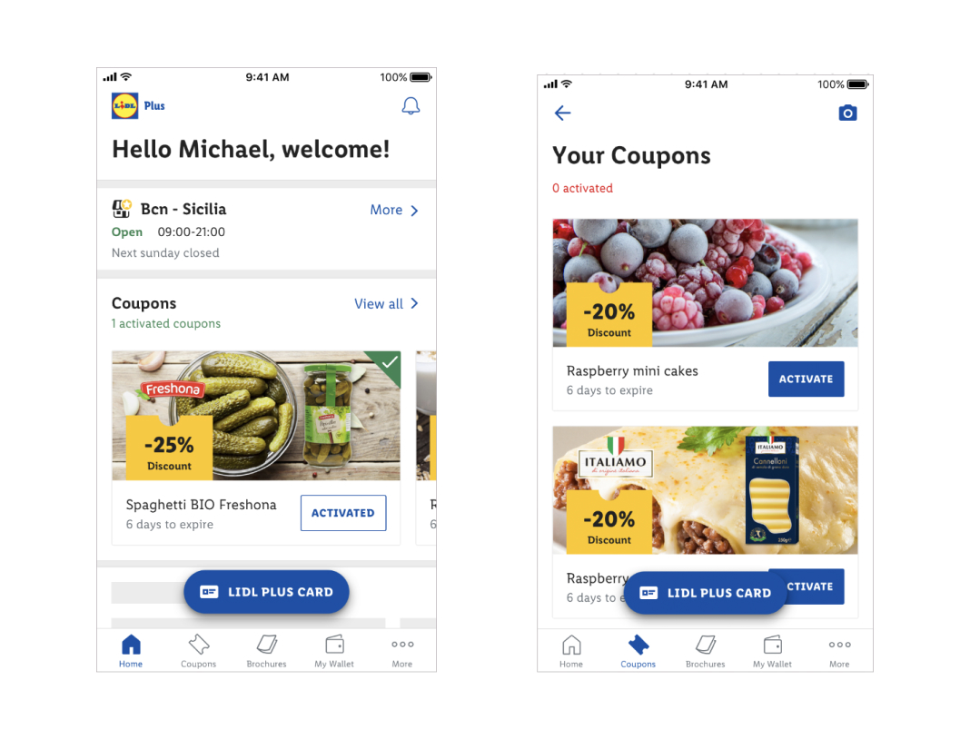
One of the core features that has driven Lidl Plus APP to more than 60M users has been the translation of the physical Coupons into the digital world.
Analytics shows that this is the feature with more interactions, with more than 300 Million taps weekly, but also one of the key conversion factors that drives users to the store.
After a few years, and more countries rolling out, coupon layout is getting outdated, but more important, we have observed that the current layout, particularly with text is getting too short in some languages.
Hypothesis
- The app is gaining more and more features with cards, a new layout for the coupons can help elders to identify coupons and its function.
- The current information architecture forces the user to scan right to left back and forth, re arranging it could improve comprhension.
- A bigger button could help activation but also improve layout in languages like German or Greek.
- A more vibrant layout can make the discount more attractive.
- Countries are configuring all the coupons as special, so at the end the attention gets blocked, losing effectiveness, we want to make special coupons look special again.
UX proposal
After considering all the above, we iterated several designs as follow: 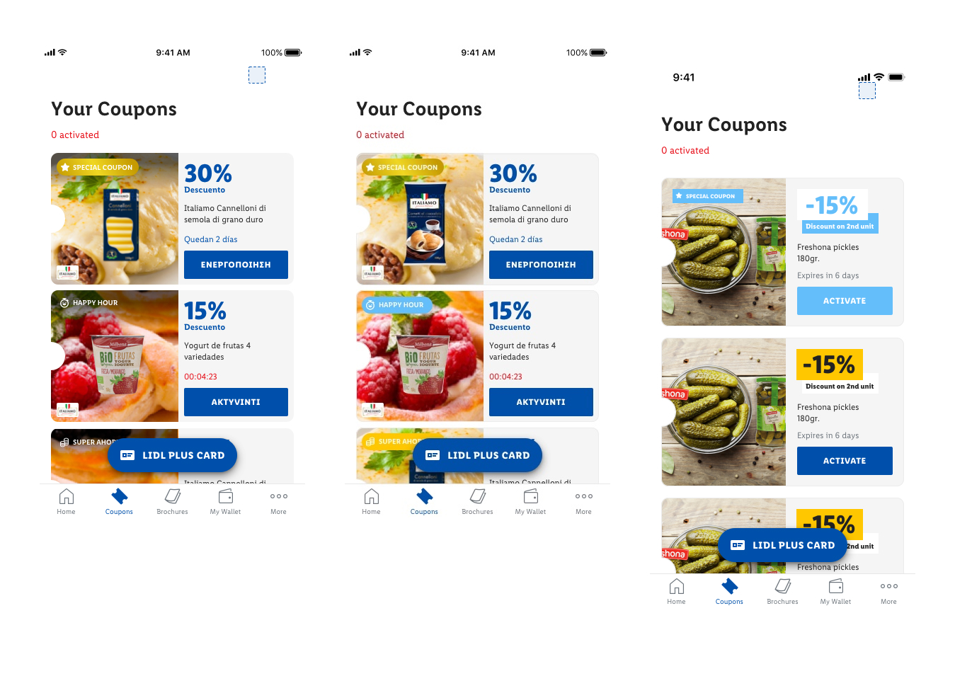 The all new proposal was based in:
- Reducing image space, countries were not using all properly anyway, and move it to the right.
- We expect user first scan left to right, be seduced by the photo, but then having all the relevant information together.
- On the information area, offering an new hierarchy of information, from the most to the least important stuff.
- Also this new layout allows a more controlled and safe space for longer languages.
- The button is bigger also.
- For ease to designers we introduced a new field on the CMS to add the brand logo, and avoid more edition to the pictures.
- The special coupon and the other coupons receive a different visual treatment.
Perception test
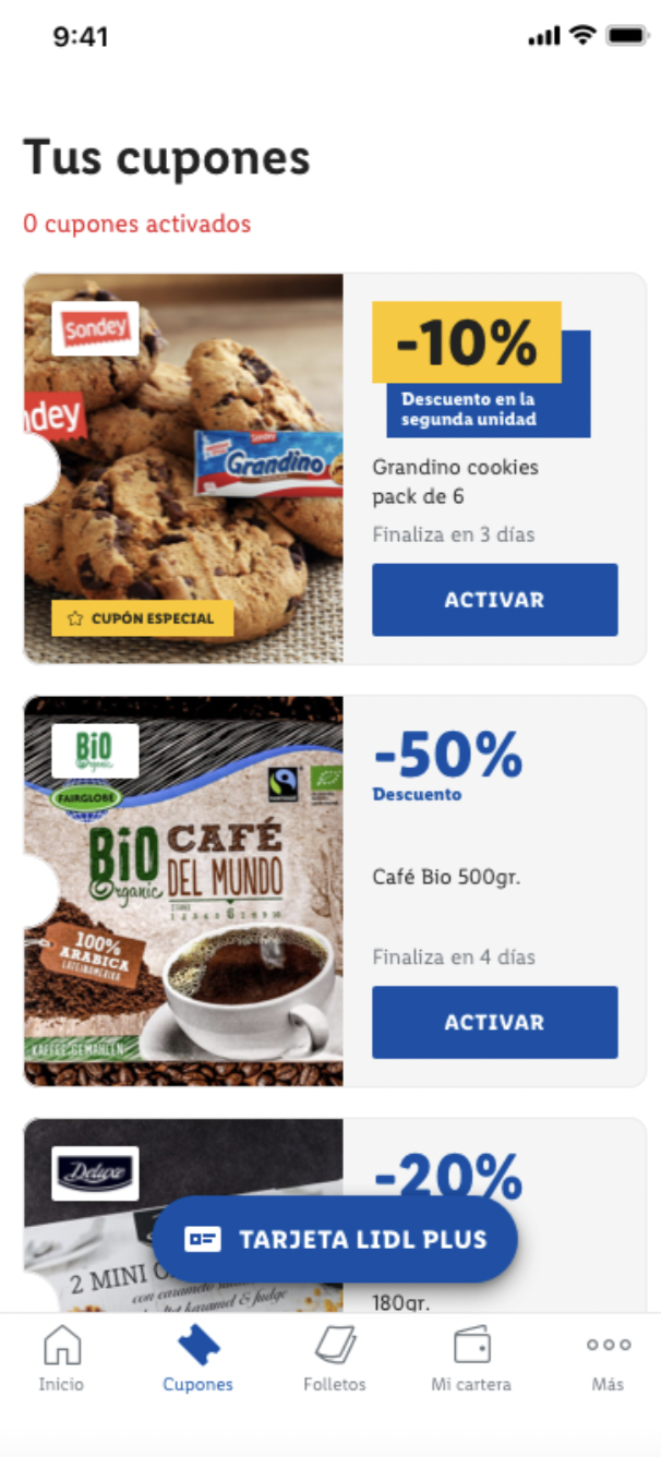
After discussing with all stakeholders we decided to test this version:
One of my biggest fears was to make the perception or comprehension worse so the method to test the new layout was a 5 seconds test, and was done unmoderated with Maze.
The test consisted in showing the users the new layout for a few seconds and then asking the following questions:
- What do you remember more clearly?
- What coupon drawn your attention the most?
- Do you remember any of the Brands?
We sent the test to 4000 thousand users aprox, 2000 would be asked regarding the current coupon (old layout), and the rest the proposal. The segments were evenly distributed with regular coupon users and people that have never interacted with them. We got approximately 10% of responses to the test.


One of the first thing we noticed is that the picture, does not matter the design was the first attention getter, but with the new proposal the Special Coupons were much more noticed, and also people remembered better the discounts.
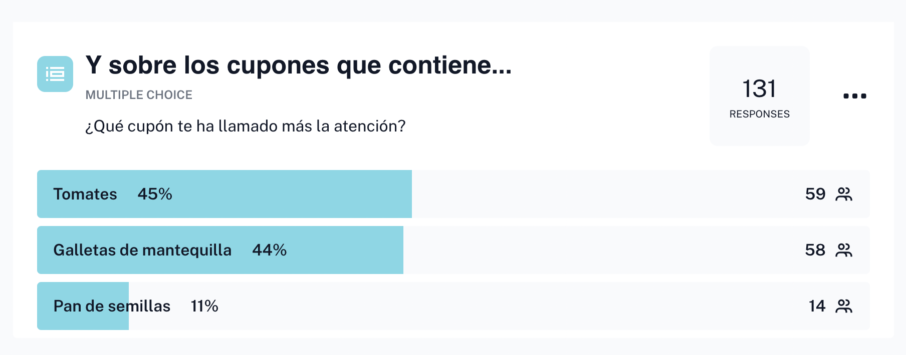
Also when asked for the brands, maintaining it in a fixed position made people remember the brand better (50% more), even thought with some writing mistakes when answering for the name of the brand.
A/B Test
After the qualitative research, we were more confident that we were not causing more confusion to the users, and seemed that the information was being easier to consume, without resting persuasion power to the product picture.
Before moving to production though, we wanted to triangulate with quantitative data to see if this particular conversion “ACTIVATE”.
We decided to launch an A/B test in 3 different countries, Denmark, Spain & Germany, the setting for the test was the following:
- Variable exposure depending the country, but never less than 10%, 50k users
- 1 month duration, to avoid micro seasonality
- 50% of the exposed would see the current design and the other half the new one
Here is a video of the test live:
When writing this lines the test is still running in two countries, but with some variations between Android and iOs (0.3%), we have an average improvement of 2% more conversions (“Activations”)with 90% confidence rate.
A typical week may have 300M taps on activate, and this is being performed during summer months, where traffic tends to decrease, so even thought it is a small improving percentage they are a lot more of interactions, and what seems even more interesting is that data points to a subtle improvement of store visits, but still being analyzed.