
Context
21 buttons is one of those few start-ups that has succeeded in one of the most difficult and expensive business models on the digital world nowadays, creating a social network and thereby a network effect. Nobody likes a social network without active users, right?
This case study tries to extend their current model by adding new functionalities to the platform in order to increase the value proposal for both the users, the companies advertised on it and the company itself.
The idea
In order to do so it would be great to take advantage of this critical mass of users, and the power of user generated content influence (x7 more powerful than traditional content) to create the 21 marketplace.
Right now buttoners (21 users) upload pictures with recommended outfits and clothes, those clothes are linked to its belonging brand e-commerce site. If someone purchases that item leaded by a 21 recommendation, 21 buttons typically gets a commission from the retailer, and the influencer also get’s paid. The transaction is done outside the application.
My approach to increase value to all the parts is the following:
What
- Brands will be now able to sell products directly within the 21 app.
- Users will be able to sell used products, and buy new/used directly and conveniently within the one single app/place.
How
- Influencers will be able to indicate what size are they wearing.
- Both users/influencers will be able to privately upload their measures.
- The app will help to identify what size and how its going to fit the user.
Why
- Retailers reduce the return rates.
- Users gain confidence and confort when trying to determine the proper size for them.
- Users can buy/sell used trendy clothes in a fashionista environment.
- 21 gets control of the transactions.
The Interface
The idea to introduce this features is to maintain the already successful existing UI in order to take advantage of the learnt usage of the community and to subtly add new functionalities along the experience, doing it in the most natural way, given the already created environment.
Header
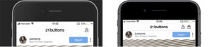
The first noticeable thing is the bag icon on a now fixed header. Placing it in this exact location, where most of the users expect it to be, will immediately be perceived and signify both new and recurring users that 21 buttons is a platform where things can be bought.
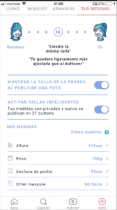
Profile section
As a core new feature to the new system, I decided to add the measures section as a new tab inside the profile page, that said, I believe it should be explained in full detail in an introductory walkthrough slider or similar.
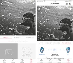
The key-points are the following.
- Using icons and Gestalt law of elements connectedness, creating an fastly scannable and self-explanatory visual brief, in order to explain the user the benefits of the 21 Fit function.
- A toggle area where users can grant 21 to privately use their own measures to compare with other users and brand size charts the best fit for them.
- The second toggle would allow to make public, when a photo is uploaded, what product size are you wearing.
- The last area would show and allow to modify, with the aid of icons to better eye scanning, each one of user provided measures.
- Also, but not pictured on the prototype, could be interesting to get information about user preferred fit, tight, loose, medium, etc.
Product Card
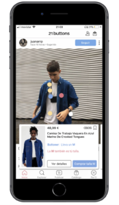
Here is where the previous 21 buttons experience starts to blend with the marketplace functionalities.
- The existing product card is expanded, gaining more white-space, allowing it to not to be perceived as there is too much visual/cognitive charge.
- This also allows the retailer to have a bigger lookbook picture.
- The app also inform the user about the buttoner/influencer worn size, the buttoner info is always highlighted in one color.
- The other color emphasizes the user perspective size fit.
- The Visit website CTA has been moved to inner product pages, instead we have an ADD TO CART button, that would add the recommended product size to the bag.
In case the product is sold by another member if the network and not a retailer, the information card would change as pictured below.
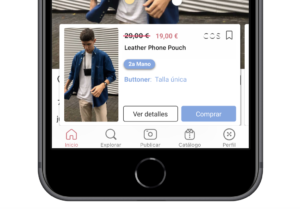
- New price and discounted price will appear (if available)
- I propose to add a blue badge (material style like with the buttoner color) stating the product is not new.
Product Details
The product details page would benefit from a big amount of new features to support the marketplace functionality.
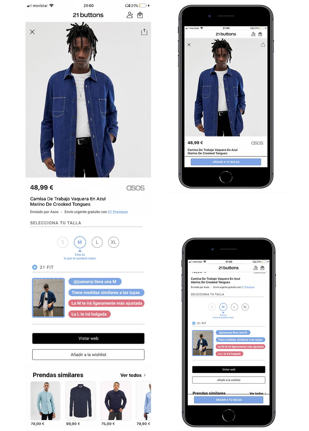
- User is informed about who is shipping the product.
- I introduce the concept 21 Premium, where, for a monthly fee, users can do as many purchases as they want, with no shipping costs.
- The size selector, with the 21 Fit concept recommendations attached.
- Following we would find the in deep 21 user product fit.
The possible struggles / successes
The success of the concept relies on adoption of the new key features, and with so, a waterfall effect.
Risks
- The fear of privacy when submitting body measurements:
- Without a significant amount of influencers sharing the size worn publicity, end user won’t engage with the measure system.
- If User do not engage and trust the privacy of their measurements, the added value of fitting recommendation falls apart.
- The value proposal to convince retailers to connect with the platform gets diluted, the app cannot convince to reduce return rates.
Successes
- The influencers adopt easily and publish sizes worn.
- End users start to provide measurements, they improve their experience by getting comparisons between the sizes of the influencers and provided by brands.
- They buy with more confidence, more frequently and return rates are reduced.
- The value proposal is evident for retailers, they connect with the app, provide more pictures, information about sizes and more allow to 21 buttons to be in control of the transaction (not just a link).